
A truly mobile-ready site will show it's readiness by adjusting itself to the size of the screen. You can open the same site on a desktop PC or a mobile device. It will adjust itself to the size of the screen. You can also test any of our mobile-ready samples from a desktop by making the browser window more narrow. As you do that it will adjust itself to the size of the screen. Here are some more samples:
This site is in development as I move content from the old site. Meanwhile, scroll down to view samples, or ...
Check out more samples at: www.LadySword.com/portfolio.
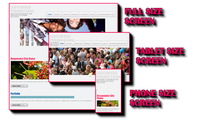
LS R1 - Responsive Joomla 2.5.X Site
Developer: Sandi Laufenberg
- Joomla 2.5.X template
- Includes Java slide show, and many other features.
- Responsive - Each page adjusts itself to the size of your screen
- Try it on your mobile device: www.ladysword.biz/r1
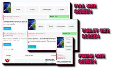
Developer: Sandi Laufenberg
- Hard-coded HTML5, CSS3
- Responsive - Each page adjusts itself to the size of your screen
- Try it on your mobile device: www.ladysword.com/samples/responsive_site1
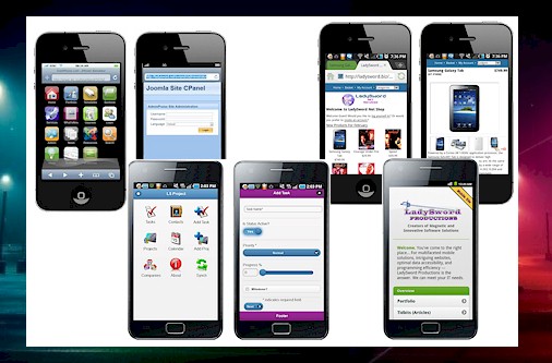
Go here to check out more samples of Sandi's mobile-ready web sites.

Learn more at: "Converting Your Site to a Mobile App"